SpotIQ
What is SpotIQ?
SpotIQ is RedEye’s latest AI-driven insights engine that will help you discover trends, outliers and cross-correlation between your data points. SpotIQ uses a GPT model to instantly analyse the metrics you select to identify drivers behind your KPI performance such as engagement, conversion and revenue.
Before diving into the written documentation, you can check out a 5 minute overview video of the new functionality here (if the video playback seems a bit too fast, you can reduce the playback speed at any time):
Starting April 2024, all standard access users and above of the RedEye platform will have full access to SpotIQ on a 3-month free trial basis. Should you wish to extend this license beyond your free trial, please just reach out to your Customer Success Manager who will be happy to help.
Getting Started
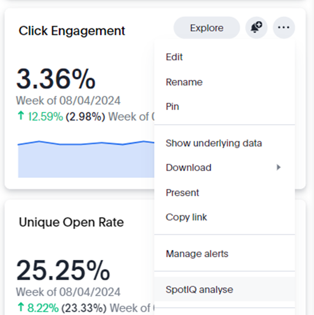
To get started with SpotIQ, simply navigate to a tile on any of your Liveboards and click to expand the 3 dots navigation menu. Towards the bottom of the options, you will see “SpotIQ analyse”, this can also be done from new, individual searches, which we will cover in more detail later on:
SpotIQ Report Builder
Selecting this option will move you into the SpotIQ Report Builder, where you can choose whether you want to find out more about Outliers, Trends or Cross Correlation (or the default setting, all 3). SpotIQ's Outlier Analysis will identify and highlight the best and worst performing activity. Trend Analysis will plot out your data over a longer timeframe to help you understand if there's a pattern to the results, while Cross Correlation Analysis will use AI to try pulling in new data points that are potentially influencing the results.
From there, you can now select the measures and attributes that you want to include in your analysis. Depending on the tile you first selected, SpotIQ will select several recommended fields to include. For instance, using a Click Engagement tile such as this one, SpotIQ will guide you towards fields such as Campaign, Schedule, Revenue Per Send and Subject Line:
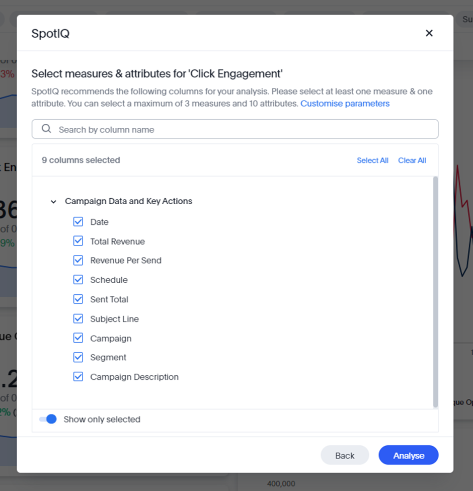
For your first analysis, we would recommend leaving the default measures selected, but here you can also toggle off “Show only selected” and choose from all the measures and attributes available in your starting Worksheet, enabling you to create your own custom analysis.
SpotIQ Analysis
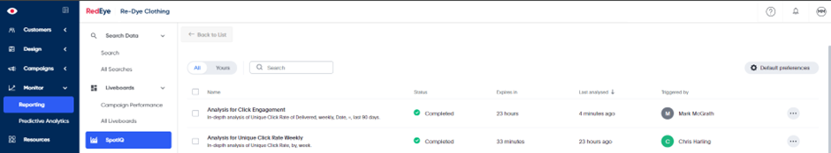
This analysis will begin running in the background, so if you now navigate to “SpotIQ” on the left-hand navigation menu, you will see your report at the top of the list:
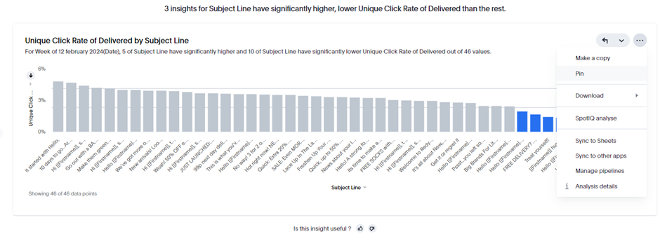
Clicking into this analysis, you will be presented with an AI-generated report in a similar format to a new Liveboard. The more data points available to the model, the more tiles it will create. Using Click Engagement, you will be presented with tiles like Engagement by Subject Line to help spot trends:
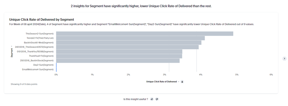
Segment-level engagement to identify outliers:
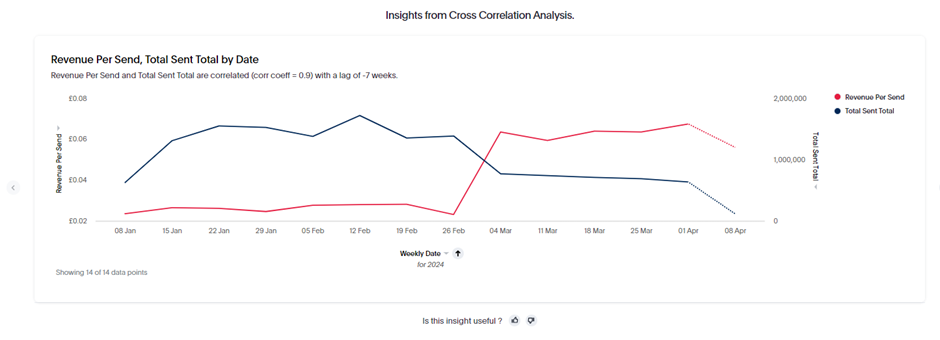
Revenue per Send will help you to identify any cross-correlation between your click engagement levels and the revenue that was driven across the same timeframes:
Just like any other tile, you’re able to copy, pin and download the content. You can even run a brand new SpotIQ Analyse on this new piece of content to begin the process again on a new set of data points.
It's important to note that, by default, the SpotIQ Analysis will expire after 24 hours.You can press “Save Insights” at the top of the report to keep this data accessible indefinitely. From the same menu you can also Share, Delete, Customise, Schedule and get a full breakdown of the Analysis Details.
Provide Feedback
Like any other Large Language Model (LLM), SpotIQ will improve based on the feedback that you share with it. You should notice the thumbs up and thumbs down icons beneath every tile. If you select the positive reaction (thumbs up), you will see a brief confirmation banner stating: “Thank you for your feedback to help improve the quality of insights!”
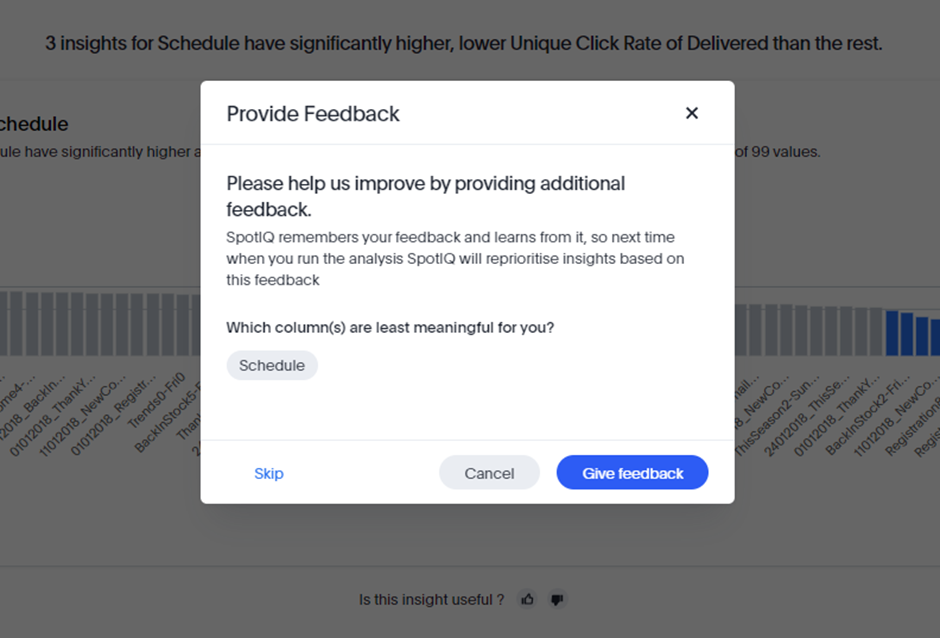
On the other hand, if a tile was generated that didn’t help you to answer any new questions, then you are encouraged to feed this back via the negative reaction (thumbs down). The most common reason for a tile adding no value is that the insight was immediately obvious. For instance, running this analysis on Click Engagement, I’m not interested in breaking down Click Rate by Schedule as this data was already available to me on my original Liveboard.
Providing positive and negative feedback is important to help train the GPT model.The better trained the model is, the more likely it is to generate truly valuable insights every time you use it in the future.
This will also benefit other users on your specific platform, as the model’s knowledge base is shared between all users.
A better trained model will help create an improved experience both for yourself and new users starting to run SpotIQ analysis.
Creating new search terms
Once you are confident with the process of creating new Analysis from existing tile content, you can start to consider building out entirely new Search terms with SpotIQ Analysis in mind. This is a great opportunity to create analysis on data points that aren’t already covered within any of the default Liveboards.
Example 1:
Let’s say you want to learn more about the differences between your new and returning website visitors, for example. Try pasting this term into your Search bar on the Campaign Data and Key Actions Worksheet:
New Users Active Users by week last 12 weeks Visits Pages Viewed Time On Site Total Responses Total Revenue sort by Date weekly descending
If you now save this Search and run SpotIQ Analysis on it, you will get a report that tries to identify the differences in behaviour between your new and returning customers. For my attibrutes I’ve selected:
Date, Campaign, AOV, Total Responses, Pages Viewed and Revenue per Visit.
In most cases, the first tile will compare campaign performance between new and returning visitors. SpotIQ Analysis will help you to understand which campaigns are the most appealing to people that have never been on site before, compared to recipients who regularly visit. This sort of insight can help to tailor your future campaign delivery and content decisions, depending on your audience.
Example 2:
Here are some other new Search terms to consider building for SpotIQ Analysis:
In the Delivery Status by Domain Worksheet, paste this Search:
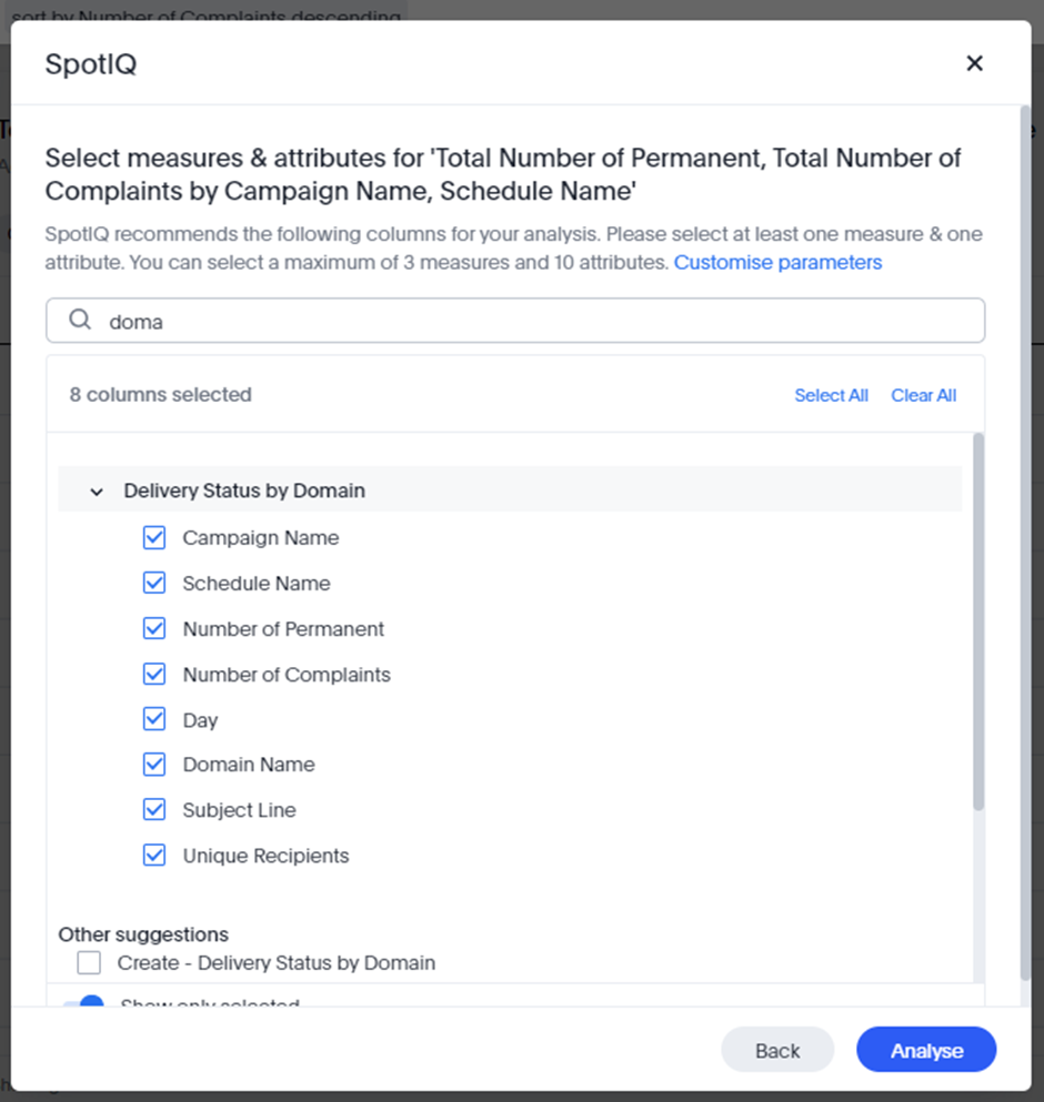
Campaign Name Schedule Name Number of Permanent Number of Complaints last 7 days sort by Number of Complaints descending
From here, select the following measures and attributes in SpotIQ to get an instant view of all Campaign and Schedule activity that has triggered any particularly high failure or complaint rates. You can easily change the timeframe or initial data points to include things like temporary failures (Number of Temporary), rejected emails (Number Rejected) or domain-level (Domain Name) analysis
Example 3:
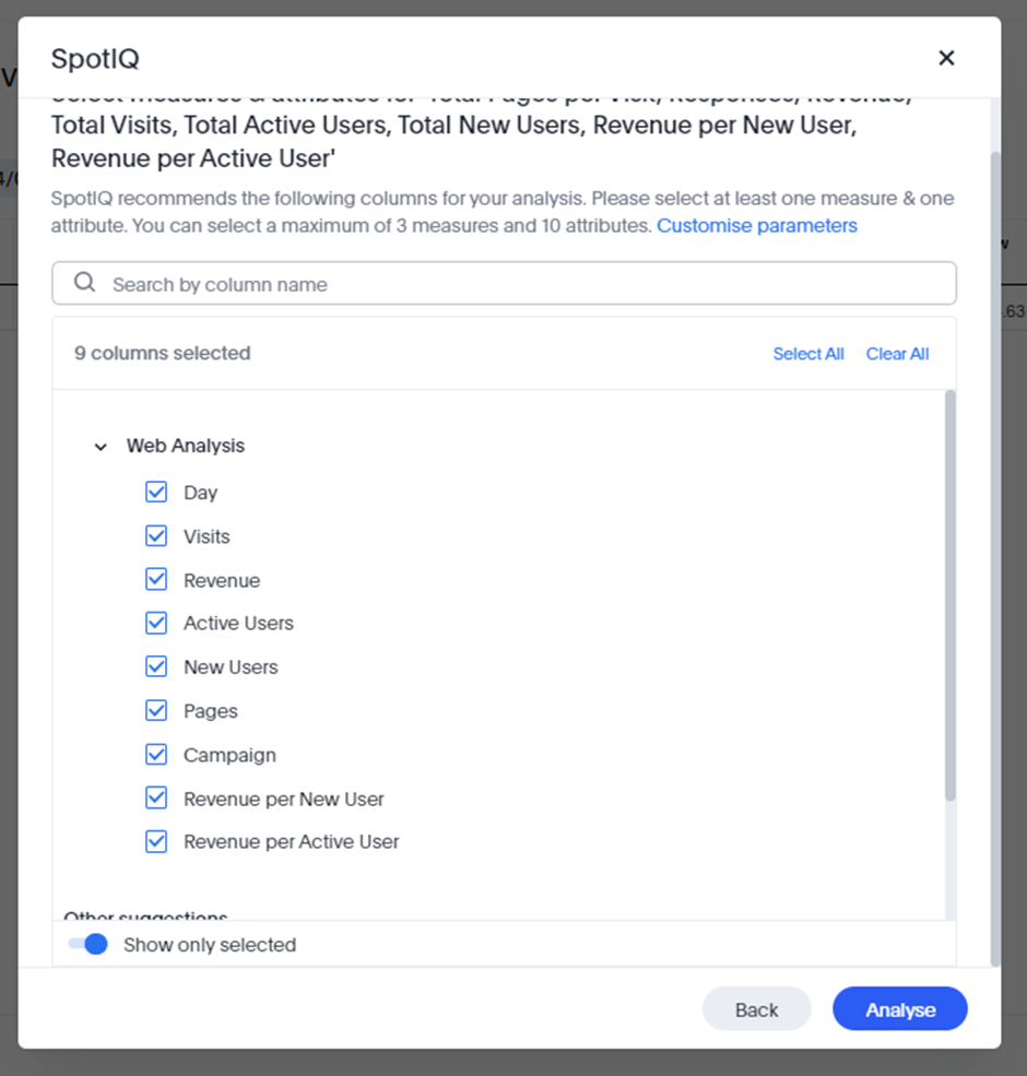
In the next example, let’s use the Web Analysis worksheet and paste the following Search:
Pages per Visit Responses Revenue Visits last 7 days Active Users New Users
We will now create two custom formulas, to derive the average revenue generated and compare how this differs between new and returning website visitors.
• Average Revenue per New User: Revenue / sum(New Users)
• Average Revenue per Active User: Revenue / sum(Active Users)
Selecting the following attributes and measures will help to identify trends between behaviour in new vs. returning visitors:
Rather than relying solely on SpotIQ for this Analysis, you could consider adding a “vs” operator into your original Search to quickly pivot the results between New and Active Users. The updated Search would be:
Pages per Visit Responses Revenue Visits last 7 days Active Users vs New Users Revenue per New User Revenue per Active User
We’ll be sharing a lot more Search examples and best practice for maximising value from SpotIQ during the free trial period, but please do let us know of any thoughts, feedback – or Search terms you’ve run that you think we should try ourselves!
Updated 10 months ago